Before going to start check this link: Seoul Bike Trip Duration
Nowadays we reduced plenty of Hard work by using Machines, Similarly, we can reduce our Smart work by using Machines that is called Machine intelligence and one of the processes of making intelligence is called Machine Learning. Today, I am going to show you, how a Machine behaves intelligently by using Machine Learning through a real-world case study. In this case study, we are going to solve everything right from scratch from End-End
 |
| Life Cycle of Machine Learning Problem |
Introduction :
We are taking Seoul Bike Trip data from Kaggle. Let us see something about data with questions of where, when, why? Seoul Bike trip is happening in South Korea in the city of Seoul and
routes are around the Han river, which is passing Seoul city. Most of the people prefer bikes for the trip, Some routes bikers preferred most of the times
- Han river/Banbpo Bridge loop: On this trip, most of the bikers starts at
Eugen station and the route pass along the Han river and finally end at
Gayang Station with a distance of 34km
- Fr 20.09 trip: This trip starts at Hoehyeon in Seoul and end at the
same place, with a distance of 33km
- Cycling in Seoul: This trip along the Han river starts at Yeouldo
Hangang Park and end at the same place with a distance of 13km, and
some other trips also there in Seoul
- Trip from Seodaemun-ga to Guragu of distance 24km
 |
| Trip Routs in Seoul city |
This data collected from different bike stands of different locations in Seoul city, It belongs to one-year data, In Bike stations, the owner need to know trip duration according to that they allowed for booking bikes.
Problem statement:
To design a Machine learning model that can predict trip duration for the given inputs
Performance measures:
Mean Square Error: This actual error due to our model for best model the value
is zero, its use used to compare different models to find the best model.
Mean Absolute percentage error: Definitely, a model gives some error in
prediction if we know how much error will happen it is good
Business constraints:
- Interpretability is important because we need to know why it will take that
much duration.
- Latency is concern
Dataset overview :
Seoul bike data of size 9.60M rows we have to design a model that
predict the trip duration by using columns
- ID: User id of the person who takes the bike for rent
- Distance: The distance a person travel on a bike
- PLong, PLat: Latitudes and Longitudes where the person take a bike for
rent
- DLong, DLat: Latitudes and Longitudes where the person return the bike
- Haversine: This is the shortest distance on earth calculated using
Latitudes and Longitudes
- Pmonth, Pday, Phour, Pmin: Month, day of the month, at what time bike taken
for rent
- PDweek: On which day of week bike taken for rent
- Temp: how much average temperature per hour, it measures in
degree celsius
- Precipitation: It indicates average rainfall per hour, it measures cm
- Wind: This is avg value per hour, it measures miles/hour
- Solar: Heat and light radiation from the sun
- Snow, Ground Temp, Dust are other independent parameters all the
values the average value of one-hour duration
- Duration: how much time will take to return a bike, This is the column
that we have to predict by using an Algorithm, It is dependent value
we have only few features only present at the time starting, they are Haversine, Temperature, Precipitation, Wind speed, Humidity, Solar,
Snow, Pmonth, Ground Temperature, Dust, and time features Pday, Phour, Pmin, PDweek
Input features Haversine, Temperature, Precipitation, Wind speed, Humidity, Solar,
Snow, Pmonth, Pday, Phour, Ground Temperature, Dust, Pmin, PDweek
Target Variable: Duration
 |
| Blog Cycle |
Exploratory Data Analysis:-The very First step to solve any case study is the proper analysis of data. It helps us better understanding data, Even though it isn't part of the model design if we analyse data and then will get valuable insights then it is easy to select a model for our problem.
In the First step, we import necessary libraries which need basic processing of data if we need more libraries we can import those at that time but keep all the libraries in starting cells after completion model
After downloading we will get . CSV file it becomes difficult to perform Maths operations then designing a model 😖.Don't worry we have pandas DataFrame to take care of all these things😎
Now we load the CSV file by using pandas and by using head it shows the first 5 rows
Let us see something about the data by Describe method, It shows Quantile values, Mean, Stander Deviations of each feature, if we have more number of features it might be confuse😉
check for missing data:
Generally, data has some missing data present, but in our data, there is no possibility for that condition
In our dataset, we don't have any NaN😲, we will check by using IsNull() and count missing rows by using sum as below
Correlation of Features: Let see how each feature is correlated with other features and also we know how each feature correlated with the Target variable, here we are using person correlation and we visualize by using Seaborn library
 |
Fig.1 Correlation
|
Here white is highly positively correlated and deep blocks highly negatively correlated, Here some features like Pmonth, Pday, PDweek are highly correlated with Dmonth, DDweek, Dday but we need to remove these features it won't much increase our performance it increases the complexity of our because if more features are there then our model needs to perform more number of mathematical operation and also it creates problems in finding feature impotence.
Now we will see the distributions of some features then we detail analysis of each feature, To get distribution plots of features in the blog we are using seaborn kdeplot as below
some of the distribution plot as shown below which are useful to analysis
 |
| Fig.2 |
Here our data is looking like time series, Distribution plot of Pmonth showing that the number of people was going to trip less in starting of years (i.e in months of January
and February ) and the number of people interested in trip increases gradually and reach max in months September and October
and then decrease
The distribution plot of Phour shows that the number of people preferring trip is more in the morning than it decreases b midday
then it increases in the evening time and distribution plot of Pday shows that all the days in a month are ok for trip. Similarly, Pmin, PDweek and Haversine these distribution plots don't have much data that's why I am not showing these plots.
Now let us see more details of Pmonth by taking Pmonth as hue in the distribution plot of Duration
 |
| Fig.3 |
The distribution plot shows that in the months of September and October are more people completed their trip in a short time
Let us go next stage of Analysis, we are going to analyse some features in detail, For every feature, we are seeing visually how it with help of PDF plot, CDF plot, Box plot, Time Series plot, QQ-plot if needed we use Auto Correlation plot and Partially autocorrelation plots also and then numerically methods like percentile values and (
ADF) Augmented Dickey-Fuller test to check data stationery.
Before going to the analysis we sample data to 10 min interval data and this data used only for time series plots only, after sampling we get some Null values because in some intervals nobody was gone to trip especially at midnight times, we remove those null values because at the time nobody going for the trip. Here datetime column we created by using Pmonth, Pday, Phour, Pmin and then converted it to datetime format by using pandas.to_datetime
It is good for programmers to use functions, class instead of writing code all the time now I am going to write a function it can plot PDF plot, CDF plot, Box-plot and give percentile values
Duration
we will use plot_fun function for the distribution plot, CDF plot, Box-plot and for percentile values
 |
| Fig.4 |
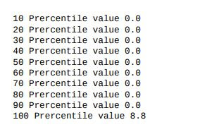
We can observe that that distribution plot is "right-skewed".That means most of the trip durations values are small, people completing their as early as possible and from CDF and Box-polt shows that 90% of people completing their trip in 1 hour, here we got some visual observation, Let us see percentile values to make it clear.
Here we can observe percentile values clearly, max value in 119 min means nearly 2 hours. Generally, we consider higher values as outliers and we try to minimize the effect of outliers if data is less, If we have more data point we discard them from our data set
But here, we have a different scenario. It might be possible lower values also as outliers because we need data on who goes for the trip, it is very fewer people who complete their trip within 2 min 😮. That why we don't need those people data
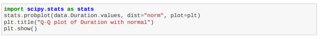
We already saw that the distribution is right-skewed but now we will use QQ-plot to check for Normal distribution. for that, we are going to use scipy library
 |
| Fig.5 |
By QQ-plot we clearly observe that Duration, not in Normal Distribution.
It is good to see Auto Correlation and Partial Correlation Plots because we have time a feature give and look like time-series data. But it not completely time-series because past values are independent of present values that can we observe by data and also by using correlation plots
 |
| Fig.6 |
Let us see how the Autocorrelation and Partial Autocorrelation plots will after sampling data to 10 min interval data
 |
| Fig.7 |
After Observing the Autocorrelation plot and Partial Autocorrelation before sampling we not getting much correlation with past values but when we sample the data then we got correlation in data that we can observe in the autocorrelation plot, But there is one point we are missing in the data we have the location of each station there are there located in different locations
 |
| Fig.8 |
To avoid that problem we will make data into clusters by using Locations into clusters then we will check this we can do in next
Distance
Distance is a feature which highly correlated with Duration but we actually don't use it at the time of the model, because this feature we don't at the time of starting the trip and but is very useful to the analysis of data.
Let's start with the Distribution plot by using plot_fun function
 |
| Fig.9 |
Distance is very similar to duration that why their distributions also similar, here we can observe the values are in meters and the max distance is 33 km, Now we use percentile values for better analysis of our feature
It concludes that few people travel less distance, Let us take some threshold value ex:100 don't allow then in our data consider the people who travel distance more than the threshold value.
Temperature:
It is one more feature in our dataset here the max value is 39.4 Degrees and min value -17 Degrees,
Let us see some plots to know about this feature by using plot_fun
 |
| Fig.10 |
It concludes that the 'Temp' feature is not in Normal Distribution, by using CDF and
box plot 80% of values between 10 degrees to 39 degrees and also we check percentile values
We know that temperature is time series lets us go for more analysis of this data firstly we will see how it varied with time and then check Stationary or Non-Stationary then finally we see how temp and Duration going on time plot, It makes more fun😃 for this purpose we are going to use seaborn line plot.
 |
| Fig.11 |
Herein, time series plot
temperature shows that temp is low at the starting of the year and reach the max
value in the months July to September then it decreases.
Let us see something more by using the time series plot of aTemp and with hue as Duration
 |
| Fig.12 |
From the above time series plot Duration shows the temp at max ranges or min ranges the trip duration is less(i.e
duration is less at starting of the year and ending of the year and between July to
September)
Now we will check the data is Stationary or Non-Stationary before going to check, we will see when we say data is Stationary
After observing the above plots we will understand when we tell data is Stationary and Non-Stationary based on Mean and Variance
To check this we can go visually by plotting the mean and variance curve in a time series plot and another way by using statistical methods like the ADF test
In our blog we are using the ADF test to check data is stationary or Non-stationary
Augmented Dickey-Fuller Test: Test is a type of statistical test called a unit root test. Unit roots are a cause for non-stationarity.
- Null Hypothesis (H0): Time series has a unit root. (Time series is not stationary
- Alternate Hypothesis (H1): Time series has no unit root (Time series is stationary).
If the null hypothesis is rejected, we can conclude that the time series is stationary.
There are two ways to rejects the null hypothesis:
On the one hand, the null hypothesis can be rejected if the p-value is below a set significance level. The defaults significance level is 5%
- **p-value > significance level (default: 0.05)**: Fail to reject the Null hypothesis (H0), the data has a unit root and is non-stationary.
- **p-value <= significance level (default: 0.05)**: Reject the Null hypothesis (H0), the data does not have a unit root and is stationary.
Now we will check our data with ADF test for Stationary
After applying the ADF test we got a p-value as shown above fig which located inside the orange region, Now we can conclude that data is stationary because of p-value is less than 0.05
Precipitation:
Precipitation is another feature in our data, It tells what is the rainfall at the time of trip start and the units used here 'mm', Let's see visual plots to get a better understanding of data
we start with distribution plots as usual then we will go for numerical understanding,
 |
| Fig.13 |
the max value of precipitation 35 cm
The distribution plot looks like power-law distribution that means precipitation
occurring very rarely, by using the box plot 35cm is showing as an outlier but by
observing the previous year rainfall in the google it was happening
Here we can observe most of the values are zeros that mean, Rainfall occurs is not a daily event we know that
Let us see how the time series plot Perception with hue as Duration column as hue
 |
| Fig.14 |
Here in time series plot of precip and duration as hue if rainfall is low duration is high and
after heavy rainfall for some days, duration is low that can observe when we zoom it by using Plotly library
Here we can clearly observe that precipitation data is stationary data
Here we can observe some correlation between Duration and Precipitation but it, not a daily event it won't show much impact when we consider all data
Wind
Wind is the feature in our data it represents with what speed wind flow happening at the time of trip start and units for wind speed is m/s in our data, Now we are going to analyse the Wind feature, let us start with the distribution plot |
| Fig.15 |
Here we can observe that the distribution curve for wind is not smooth and in the changes occurs more but
the range of changeless below 3.by using box plot and percentile values 90% of
values are less than 3 and the values above 7 may be outliers and also we can observe in percentile values
let's see how the time series plot Wind
 |
| Fig.16 |
From the above plots, we can observe there is no much effect of wind on the duration and check for data is stationary or non-stationary by using the ADF test
Here p-value is less than 0.05 that we can clearly observe from the above that mean data is stationary
Humidity:
The humidity feature tells how much humidity in air present at the time of the trip start and units are %
 |
| Fig.17 |
Max value of Humidity is 98%
The distribution plot is not a smooth curve and box plot values show that there is no possibility of
outliers that can be observed by using percentile values as below
It's looking good data, let's see how the time series plot with hue parameter as duration
 |
| Fig.18 |
By time series plot Humidity the value is low at the starting of the year
and reach the max value in the months July to September then it decreases and
to check the data is stationary (mean and std is constant values at any time) we
used augmented dickey-fuller test here p-value is less than 0.05 that mean
Humidity is stationary data that we can observe below

Solar
Solar feature this anther feature in our data, let visualize the data for better understanding
 |
| Fig.19 |
Here we can observe, The distribution plot is a smooth curve but it is not normal by the QQ plot, box
plot and percentile values show that there is no possibility of outliers and here
30% of values zeros because at night solar value becomes zero, It can also observe by using percentile values.

Here we can observe max value is 3.52 and many of the values are zeros
After Observing QQ-plot we can clearly say that it is not normal distribution data, let analysis more by using time
 |
| Fig.20 |
In time series
plot Solar the value is low at the starting of the year and reach the max value in
the months July to September then it decreases, by using Plotly library we can observe after zoom, The data is stationary that we can observe by using ADF test, here p-value less 0.05
Snow:
Snow is a feature that represents how snowfall happens at the time of trip start,
 |
| Fig.21 |
Wow! what plots, By observing box
plot and percentile values show that there is the possibility of outliers and here 90%
of values zeros, because snow happening is a rare event in Seoul, this we will get by percentile values
Snow is stationary data that we can observe by ADF test
Ground Temperature
The ground-level temperature at the time of trip start, this feature is similar to temp that we can see later but now, we will look at how CDF, PDF and Box-plots visually
 |
| Fig.22 |
Max value of GroundTemp 62.2, The distribution plot is not smooth curve and box plot and percentile values
shows that there is no possibility of outliers and here 90% of values less than
35 that we can confirm with percentile values
Now we will see how the Time series plot
 |
| Fig.23 |
Time series plot GroundTemp shows that Groundtemp is low at the starting of the year and reach the max value in the months July to September then it decreases,
plot with hue is Duration shows the temp at max ranges or min ranges the trip
duration is less(i.e duration is less at starting of the year and ending of the year
and between July to September) and .by augmented dickey-fuller test here p-value is
less than 0.05 that mean ground temperature is stationary data
Before a while, we saw there is some relation between Ground Temp and Temp, Generally, we know the relation between them, Let see how they are going on the time plot
 |
| Fig.24 |
Dust:
Dust is another feature used to predict the trip duration, it indicates how much dust present atmosphere, let us see how the dust data
 |
| Fig.25 |
Max value of Dust 304, The distribution plot is not smooth curve and box plot and percentile values
shows that there is a possibility of outliers and here 90% of values less than
75 and check percentile values
Here we can observe a difference between 90 and 100 percentile, let see more values from 90 to 100
In this, there might be possible for outliers there more gap between 99 and 100 percentile values
Time series plot Dust shows that it rotating around 20 continuously there no lot
of change occurs, plot with hue is Duration shows the when the dust is there for a long
time then that time trip duration is less. by augmented dickey-fuller test here the p-value is less than 0.05 that mean Dust is stationary data
Finally, this data is good because the outlier possibility is very less and it doesn't contain NaN values
Now we will Latitude and Longitude values for more exploration
Let's group data by using PLati, PLong

By Grouping on PLati, PLong and count on id and mean on duration, the data has
1524 starting locations but in some starting locations has less than 10 people i
will feel those are outliers because in a bike stand we need to take more bikes for
rent, Some people trip duration is less than 2 minutes that mean that are not
complete their trip they might be stopped because any reasons and similarly some
people did not travel more than 200 meters and they also consider as outliers
Now we will group by PLati, PLong, DLati, DLong to find the number of people travel from one location to another location.
Between two places(locations) a single person also travels I feel that it was an
outlier because he might be stopped because of any problem with the bike or he
used the bike for different purposes other than the trip.
Data-Preprocessing
We observe that our data doesn't have Null values, but there is a possibility of outliers in data as discussed above, Let's try to remove them because we have a lot of data points.
Above we are creating two data frames df, df0
df: It contains PLati, PLong, DLati, DLong values after removing number of people travelled less than 6
df0:It contains PLati, PLong ie. station locations here we are allowed if the number of trips from that station is greater than 20
Let us take these locations(Latitude and Longitude) values from the original data by merging as below
Then it is necessary to check how much data is removed from original data, if it is more then it becomes difficult for our model to give more accurate results, here we lose only 4.78% of data from original data it is ok to get
Modelling
In the blog, we are going to see two types of modelling techniques
- Time-Based Modeling: here we have time is given as a feature hence we apply few time-based models Ex: Moving Average, Weighted Moving Average, VAR, Prophet
- Complex Modeling: We also check some Complex model Ex: XGB Regressor, Support Vector Regressor(SVR)
Input features: Pmonth, Pday, Phour, Pmin, PDweek,, Temp, snow, precip, wind, dust,
ground temp, PLati, PLong
Output: Duration
Time-Based Modeling:
Before going applying models lets look at the data, Here in data we have data of different regions that we know by Latitude and Longitude value, because of that there is some difference in temperature, Humidity, Precipitation, Snow and also on other features, to avoid this problem we will make whole data into different clusters of regions by using K-Mean clustering on Plati and PLong then we apply our models, After that, we will check without clustering based on the performance of model we finalize a model for our data
Cluster-Based Modeling:
Initially, we will make different clusters of regions based on PLati and PLong using K-mean cluster, Here I am making it into 30 regions
Here we clu is a function to make data into clusters, It good to visualize clusters
 |
| Fig.26 |
Regions as shown in the figure, we have data with clusters and each cluster has time has an index, Now we are creating 10 min bins in each cluster as below
Now we have cluster data with time bines but all regions are mixed in data, Let's separate them by using group by function on cluster and time bine
It is time to start modelling:
Actually, we don't know which model performs well on our data, Let's try with different models then finalize one model
Firstly we will start with simple Univariate Models:
- Simple Moving Average
- Weighted Moving Average
- Exponential Weighted Moving Average
For a simple univariate model, we need a Duration column based on the time index from each cluster of data
Simple Moving Average:
 |
| Moving Average |
In this time-series data, most of the present data depend on past data by using that past data we will predict future value by using
Moving average, Moving average is used when the data is univariate time-series data
n is the number of past values, n is a hyperparameter that we will find
Let apply moving Average on our data
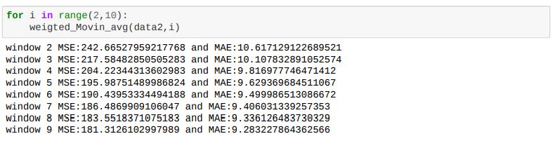
Here we can observe mean square error and mean absolute error are the values used to find the performance of the model, let us see the performance of the model on different 'n' values
Here we can observe Mean Absolute Error and Mean Square Error decreasing and as window size increasing then change in error is very less
Weighted Moving Average:
 |
| Weighted Moving Average |
In Moving Average Model used gave equal importance to all the values in the window used, but we know intuitively that the
future is more likely to be similar to the latest values and less similar to the older values. Weighted Averages converts this
analogy into a mathematical relationship giving the highest weight while computing the averages to the latest previous value and
decreasing weights to the subsequent older ones
Rt-1, Rt-2 ... are past values and N, N-1 ... are weighting for past values
Let see how the code look like
Here also MSE and MAE are performance measures based on that we select 'n' value
Now we will how values we gatting for different n values
In weighted moving average also we are getting closed results with moving average results
Exponential weighted moving average:
 |
| Exponential weighted moving average |
Weighted averaged we have satisfied the analogy of giving higher weights to the latest value and decreasing weights to the
subsequent ones but we still do not know which is the correct weighting scheme as there are infinitely many possibilities in which
we can assign weights in a non-increasing order and tune the hyperparameter window size. To simplify this process we use
Exponential Moving Averages which is a more logical way towards assigning weights and at the same time also using an optimal
window-size.
In exponential moving averages, we use a single hyperparameter alpha (α) which is a value between 0 & 1 and based on the
value of the hyperparameter alpha the weights and the window sizes are configured.
To find Exponential Weighted Moving Averages we used pandas. ewm function with hyperparameter N.
Here also MSE and MAE are performance measures based on that we select 'n' valueNow we will how values we gatting for different 'n' values.
In exponential weighted moving average also we are getting closed results with moving average results.
In univariate models, we are not getting good results, Let's see how multivariate models will perform on our data
Multivariate Modeling
Up to now, we applied univariate model and they are not performed well as we expect, Now we apply some complex model to our data
- Vector Auto Regressor
- Prophet
Before applying the model let's check how the past values of other features(Temp, Snow, Humidity, Precipitation ...) are affected Duration, for this purpose we will
Granger's Causality TestHere we consider only a random cluster and we applying Granger's Causality test then we check coefficient values
Let's see something about Granger's Causality test
Granger's Causality test: Generally in time-series data, past values of one feature will affect other
features. By using this test which features are affecting more we will know
- Null Hypothesis(H0): Past values of time series(X) do not cause other series(Y)
- Alternative Hypothesis(H1): Past values of time series(X) cause other series(Y)
In this test 0.05 is used as a threshold value
Let's look at outputs of the test here we consider only the past 10 lages
Here we can observe that lag values how the features affecting Duration if feature lag values less than 0.05, the importance is more compared to other features.
By Applying Granger’s causality tests on cluster data the lag features of
Temp, Wind, Humid, Solar, GroundTemp, Pmonth, PDweek, Phour are has non zero coefficient values but other features have some lag
values have zero coefficients, but here Pmonth, Pday, PDweek, Phour has different scenario there may possible for 10 lags the values might be same
Let's create our data for train and test
Here we separated each cluster then we make each cluster into 10 min time interval bins and also split the data train and test in each cluster. then we store train datasets in list_train_clu and similarly test data set in list_test_clu
Now we apply our Multivariate Time Series Models
Vector Autoregression (VAR):
The model used when data is Multivariate Time-series data and Time-series are influencing other time series. In the VAR model, each variable is modelled as a linear combination of past values of itself and the past values of other variables
in the system. Since we have multiple time series that influence each other, it is modelled as a system of equations with one
equation per variable (time series). Order is a hyperparameter that is used in VAR
In this Yt−1
lag values of 1
st
feature and Yt-2 lag values of 2
st
feature and similarly other features
Let's see the code for VAR model
Here we applied VAR model to each cluster then we got MSE and MAE error for each cluster then take
mean of error then results
Ho here we are getting large error values, It is not working well lets us see a more complex model
Multivariate time series forecasting using Prophet
The prophet is a model we can use for both Univariate and Multivariate time-series forecasting and it has a lot of parameters for fine-tuning the model and also most useful is it tunes the parameters automatically 😲 and also give confidence intervals of output
Let's see how the code will
Here also we will get MSE and MAE values for each cluster then we take the mean of them
Here we can observe error values for 28,29,30 and also mean errors of all cluster, the error values less compared to all the above models above
let's see how some complex models perform on our data
Complex Models
Before applying models, In our data, we have latitude and Longitude values but we are not used them, let's try to use those features
For that purpose instead of using original latitude and longitude values, we going to use cluster centre values, we will get these venter values from 'KMean'
We have also Latitude and Longitude values in the data, Now we group the data by using the cluster, time_bin
Split the data train and test, here data1 split 90% for train and 10% for test data, because of we have time data we don't apply stratify
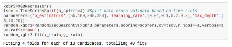
Before going to apply models, for the complex models have a lot of hyperparameters, to find the best hyperparameters we are going to use Grid SearchCV or Randomized SearchCV, but in GridSearchCV we can use only one scorer but we have two scores for that we create a dictionary of scorers it contains methods of MSE and MAE

Let start with simple complex models
Ridge regressor
A Ridge regressor is basically a regularized version of a Linear Regressor. i.e to the original cost function of linear regressor we
add a regularized term that forces the learning algorithm to fit the data and helps to keep the weights lower as possible.
let's how the codel
Here we are used RandomizedSearchCV to find hyperparameters and we have time data for instead of using normal Cross-Validation here we are used TimeSeriesSplit, Lets see how the performance
Here I using split2_test to check performance because, when using split0 and split1 the training data is less, but at split2 we have more train compared to others because we are using TimeSeriesSplit, we got around 8.51 MAE as a minimum and all values are close, It is good results let's try more complex model
Support Vector Regression (SVR)
Support Vector Regression (SVR) uses the same principle as SVM, for regression problems also, in SVR we will try with different kernels and different hyperparameter values
here degree is applicable for polynomial kernel only, let see how the results
Here we got poor results compared to all above model MAE 36.55
XGBRegressor
XGB models are widely used model in Machine Learning because their performance and training is fast, here we can use GPU also to train, this big advantage to the XGB model
Let's see code snippets for XGBRegressor
Here we are used hyperparameters n_estimators,learning_rate,max_depth with RandamizedSearch CV with 5 splits, Now we will check the performance by using the last split ie. spli4
we know cv_results in this split4_test value are useful values to find hyperparameters, In this at 7th position we have fewer values MAE=7.46 and MSE=112.8 this values occurred for max_depth=10, learning_rate=0.01, n_estimaters=200 they better results compared to now
we have features but we don't know which feature is of importance, Let's find which feature important by using the XGB model

Phour, PDweek, Ground temp are the most important feature in our data
Now we see the results of all models in a table to find a good model for cluster data
Up to Now for Modeling we are used Clusted based data, Now we check the models how they are performing without clusters
Without Cluster
We saw how the models perform on cluster data, Let see if won't cluster the data then train the model then check the performance
For this, we take original data then we create datetime column as disused above then we have the features Duration, Distance, Pmonth, Pday, Phour, Pmin, PDweek, Temp, Precip, Wind, Temp, Precip, Wind.
Now we will resample the data to 10 mints interval data by taking the mean of other feature as below
By the re_sample data we got
Here we got only 52269 rows, Let's split data train and test
we split the data 90% as train and 10% as test data, Now we start with simple models then we try complex models
Simple Moving Average
Let's directly step into code snippets
Compared to the cluster-based data model here codel is simpler, Now we will see the performance
Wow, 😲 we got very good results for a simple moving average model here we got MSE 82.14 and MAE 6.17 that we can observe above
Weighted Moving Averages
Here also we directly see code, It is also small code but we will get more accurate results, let's see
Here we will get simply replace online of code from moving average, here also we getting a close result with moving average
It closed values MSE 83.01 and MAE 6.16
I am not going to discuss the Exponential Weighted Moving average because it is also performing same as the above two
Let's directly jump into a complex model
XGBRegressor
Let's see how the XGB model perform on without cluster data, codel is simple
Here also we were used TimeSeires Split and RandmizedSearch for finding good hyperparameters after this we will get results, Let's check the results, as usual, we use the last split values to find hyperparameters
XGBRegressor performing pretty good on this data that we can say after observing the above values MSE 21.02 and MAE 3.19
Let's train our final model using XGBRegressor on this data
Let's see cluster-based model results in Table
Conclusions
- Models performed pretty well on resample data without clustering
- To improve performance we can also more complex model like deep learning
Deployment
It is the final stage, I am going to deploy using AWS
Before deploying our model we need a web page that we can create by using HTML and we need API for that we create an API by using Flask, For the code
Link To deploy in AWS, we need to create an EC2 instance as follow

After that we need to connect to server by using ssh cmd, then upload all file, then we install necessary libraries, then we run our model in server as a blow
After Deploying our mode we will go to our web page then it looks
If you gave proper inputs then we get results
Some Sources that I Learn :


Comments
Post a Comment